Interpretation
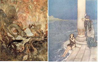
The Little Mermaid by Hans Christian Anderson (1836) is a dark fairytale for those who have read the book, the Disney story shows the girl getting the guy, well in the book the ending is very different as the mermaid turns into sea foam. It has been illustrated by many artists who have all had there own take on the story, the examples below show how they represent the time, place and point of view of the illustrator. Each illustrator would have done things differently if within their time there were more mediums to use.
Lieutenant Vilhelm Pedersen (1836)
Edmund Dulac (1911)
Disney (1989)
Christian Birmingham (2009)
Deliver
Depending on the brief I will need to decide what the best type of communication would be. There are alot of platforms that I could choose from for example; adverts, web design, billboards, posters, magazine work, window displays, illustrations and installations. Depending on the target audience of the brief I will need to choose the best suitable outcome. A good example of this would be the persuasive techniques used for Skoda cars. Skoda cars were not very popular so the company Fallon updated them and promoted them using impressive TV adverts. The first TV advert was promoting the car for families, "The New Fabia. Full of Lovely Stuff". Creating a car out of cake with the Sound of Music soundtrack ("these are a few of my favourite things"). The advert was very clever, it did not show the fundamental and original advert where cars are driving down a long road, they stood out with this advert. The adverts appeared in shows such as Britian's Got Talent and Big Brother. It first broadcasted on May 17th 2007. Fallon has recently made a new advert for the new Fabia vRS, the advert promotes the meaner side to the car, sharing the same strapline as the orginal with a twist; "Full of Meaner Stuff". The target audience for this seems to be younger men as the advert shows a darker twist. For example the background music is still the Sound of Music but heavy metal syle. The advert also shows muscular men more like rockers (motorcyle lovers) building the car with vultures pecking at bones, men head butting and biting doors and snakes are the engine. It's another fun advertisment. They also have created a microsite http://www.skodafabia-vrs.co.uk/ where you can debate whether your full of lovely stuff or meaner stuff.
Bibliography


No comments:
Post a Comment