Thursday 9 December 2010

ITAP- Lesson 9

The Novice to Expert Scale- Hubert Drafus

I would rate myself on this scale to be a Proficient, as throughout my work I have shown good practice and always manage to deliver a good solution to the brief. The solution is always shown to be of a good standard and I present my work well to a group or assessor. I always consider the target audience through my work and use visuals of other artists/designers work to clearly identify where my inspiration came from. I work through the use of mind maps and sketches to gain interesting ideas. Some examples of my work are shown further below.


I have always been interested in Graphic Design. Typography and looking at different ways to communicate to an audience is my specialty. I believe now that a suitable career for me would be in the advertising industry because I work best through my emotions. Creating a solution through persuasive techniques is something I work well with. For instance, recently, I created a storyboard for a TV advert against domestic violence. The delivered presentation was very well received and I had so many intriguing ideas for it. Of course it being my first year in university this all could change, but at the moment this is what I feel more confident in.

My Sketchbook Examples...

Brief- Design/ update a campaign
using a existing client.

My Researching (just one of my many pages
of good relevant research)


Storyboarding one of many ideas.

Looking at different ways to use type. In this
case looking at re-stylising Women's Aid.

Looking into typography digitally, focusing on
colour and what works well with what.

Then how I presented this particular piece of work. Using
the best idea, storboarding it much bigger so it's easy for
my audience to see.


My Favourite Expert

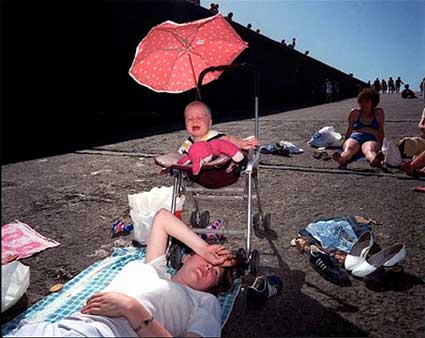
Although I am a graphics student, I have always been inspired by Martin Parr’s work because I love his innovative way of documenting the culture of the UK and abroad. My favourite works of his are his photographs of the British, particularly the seaside resorts of Brighton. He highlights our foibles and defaces us. His work could be seen as offensive, but I believe that is the beauty of his picture taking and there is truth in the images. He also takes on the stereotypes of the countries he visits. I found his blog to be very useful; http://www.martinparr.com/blog/. I find Martin Parr influential because of his satirical approach.


Bibliography

Wednesday 8 December 2010

ITAP- Lesson 8

Peter Kennard
How Text Changes the Meaning of the Image
An image can alter a person’s feelings drastically whether it be for political reasons or emotional. For instance; taking a campaign like Domestic Abuse the poster or advert needs to gain an audiences’ disgust and be thought provoking to be effective. Adding text to the image can somewhat change a person’s reaction to the image in a different way. For example; political activists use humour to appeal to an audience. Photomontage artist Peter Kennard takes iconic images and merges them together to shock the audience even though they can be seen as humorous. However, to gain a better perception of an issue, text can change an image. Photographer Jim Goldberg took photographs of residents in a hotel and runaways on the street. He then got them to handwrite comments about themselves. The comments vary from fears and dreams to perceptions and illusions about themselves or their life. The one particular photograph that captured my attention was the image of the girl who looks skinny enough to be anorexic at a distance, but you look closely and see a scar, you then read the text and she describes her past and how her family hurt her “the fucked up ass hole shot me when I was 12 years old” (spelling mistake intended- her grammar). The message therefore deepens in what only can be described as disgust as you realise the girl is homeless not by her own doing and why she is indeed thin.
Jim Goldberg


John Heartfield
How Text Influences our Emotions
Text adds a story or feeling to an image. The text can alter a person’s prospective, particularly if the image is quite funny yet the text is a deep, political issue. For example; photomontage artist John Heartfield took on satirising Hitler. He made comic scenes that involved Hitler and added text to illustrate the scene in a political view. His most memorable work is "Hurrah, the Butter Is Finished!" here a typical German family are sitting at a table eating iron. Iron which ranges from weaponry to bicycle handles. The caption below the image states that “iron has always made a nation strong, butter and lard have only made the people fat”. Therefore, the image becomes disturbing and thought provoking. Changing our emotions can change our views on a subject. The images that use text aren’t always dark though, another artist that uses this concept is the brilliant Graham Rawle, he also is a photomontage artist that worked for the Weekend Guardian, he was the creator of the Lost Consonants series. The series was a text and image word play where he would take a sentence that has one crucial letter removed which alters the meaning. These were engaging as the reader would try and work out what letter was missing and are also humorous because the images were created from the sentences.
Graham Rawle

Bibliography

Monday 29 November 2010

ITAP- Lesson 7

Developing Ideational Fluency

Mind mapping is a brilliant way for practioners to explore ideas, the more ideas forming onto the mind map the more obscure they become. Mind mapping is a unique way to summarise information and to show your thought process through a complex problem. classification is an imporatant key through mind mapping as are subheadings and burrowing (branching) out of an idea. The spontaneous thinking of ideas is generated through mind mapping. A few examples;


The examples above are visually effective. The more observational and creative they are the more effective they are to the practioner. The examples above show how the practioner has engaged well with their thought processes and have used colour, type and images to effectivly display spontanivity. This is an example of my thought process for a brief on a student guide I was going to be designing.


 An artist who I find inspiring and spontaneous within his works is Rob Ryan, he goes beyond the boundries of traditional artistic methods; he uses scalpel and paper to visually capture his ideas. Here are some of his beautiful works of this year...


Managing a Creative Environment

A great inspirational workspace is the key to great ideas. Each workspace is personal to the practioner; items collected, sketchbooks, special dates, photographs even toy figurines could be shown to influence the mind of the practioner. A workspace doesn't necessarly have to be tidy, enough room needed to draw and place a lightbox maybe, however, the walls should be covered in items which inspire the practioner or work that needs to be developed. More importantly work situated at eye level so it's always noticeable and you don't forget it. A good blog which was useful in my research was: http://www.eightyonedesign.co.uk/how-would-you-improve-your-graphic-design-studio-or-office/ which has a long list of work spaces and places which are above the normale, also artistic and inspiring.
   My workspace at the moment is my bedroom. My room is meduim sized and I keep my laptop and lightbox ontop of my chest of draws. I also have a shoebox where I keep all my brushes and paints. I am a very organised person, although, when it comes to art I have a board where I keep collected items for inspiration. If I had my own place I would have a studio but because I am a student living at home I haven't got the say in turning half of my bedroom into a work area. However, I work around it and display work in folders and sketchbooks.


Pixar Workspace area- Inspirational. Would be my dream job
to work in an area like this. No wonder they came up with great
animated movies like Monsters Inc and The Incredibles.
Examples of collected work spaces from BCU Fine Art students, Margaret Street.

Sam

Morna

Roseanna

Laura
Bibliography

Friday 12 November 2010

ITAP- Lesson 6

Interpretation

The Little Mermaid by Hans Christian Anderson (1836) is a dark fairytale for those who have read the book, the Disney story shows the girl getting the guy, well in the book the ending is very different as the mermaid turns into sea foam. It has been illustrated by many artists who have all had there own take on the story, the examples below show how they represent the time, place and point of view of the illustrator. Each illustrator would have done things differently if within their time there were more mediums to use.

Lieutenant Vilhelm Pedersen (1836)

The illustration above shows a victorian feel. Beautifully
mastered with nothing but ink. Black and white tonal work
gives greater detail to the face. The story itself is very moving
dealing with death and love, you can see that these illustrations
have alot of religion involved.


 Edmund Dulac (1911)

Dulac introduces "The Little Mermaid" into colour. Colour
used to enhance the fairytale, especially the ocean and the
sea creatures. Perdensen vision focuses on the people of the
tale, whereas, Dulac is very interested below the sea and the
emotion of the story with fine lines and detail. Dulac uses
gouache.


Disney (1989)

Disney changed the tale alot, giving the mermaid
a name "Ariel". They particulary changed the
ending. They created it more for children, there-
fore the animation and bright colour appealed
to the younger audience. The creatures and people
are all simplified, imaginative and joyous. The characters
of the story also had unique voices ie. Sebastian-
Jamaican accent. Ariel looks innocent and she relates to
the younger audience, Disney made it a moral story too.


Christian Birmingham (2009)

Lastest illustrations of the original story; colourful. Birmingham has made
"the little mermaid" beautiful and it really focuses on her beauty and niavity
especially with the meeting of the sea witch. The illustrations are very realistic
with the movement of the ocean. Sophisticated and loveable.


Deliver

Depending on the brief I will need to decide what the best type of communication would be. There are alot of platforms that I could choose from for example; adverts, web design, billboards, posters, magazine work, window displays, illustrations and installations. Depending on the target audience of the brief I will need to choose the best suitable outcome. A good example of this would be the persuasive techniques used for Skoda cars. Skoda cars were not very popular so the company Fallon updated them and promoted them using impressive TV adverts. The first TV advert was promoting the car for families, "The New Fabia. Full of Lovely Stuff". Creating a car out of cake with the Sound of Music soundtrack ("these are a few of my favourite things"). The advert was very clever, it did not show the fundamental and original advert where cars are driving down a long road, they stood out with this advert. The adverts appeared in shows such as Britian's Got Talent and Big Brother. It first broadcasted on May 17th 2007. Fallon has recently made a new advert for the new Fabia vRS, the advert promotes the meaner side to the car, sharing the same strapline as the orginal with a twist; "Full of Meaner Stuff". The target audience for this seems to be younger men as the advert shows a darker twist. For example the background music is still the Sound of Music but heavy metal syle. The advert also shows muscular men more like rockers (motorcyle lovers) building the car with vultures pecking at bones, men head butting and biting doors and snakes are the engine. It's another fun advertisment. They also have created a microsite http://www.skodafabia-vrs.co.uk/ where you can debate whether your full of lovely stuff or meaner stuff.


Bibliography

Thursday 4 November 2010

ITAP- Lesson 5

The Hero's Journey

Monomyth- one underlying fundamental story

I will be analysing Harry Potter and the Philosopher' Stone under the influence of Joseph Campbell's theory of monomyth stages;

-Spoiler Alert-

I- Departure
  • The call to adventure= Harry recieves letters from Hogwarts, although, Uncle Vernon will not let him open one. He knows they are about him thus the thrive to read one
  • Refusal of the call= The Dursley's will not let him read the mysterious letters and they force him into hiding
  • Supernatural Aid= Hagrid the magical half-giant comes to Harry's rescue to tell him all about Hogwarts, "Your a wizard Harry" and relief him from the Dursleys
  • Crossing the first thresold= Arriving at Diagon Alley with Hagrid who tells him he is "the boy who lived", Harry then knows only now that his parents were murdered by a dark wizard
  • The belly of the whale= The fight with the troll
II- Initiation
  • The road of trials= Harry's Lessons, the fight against the troll with Ron (saving Hermonie)
  • The meeting with the Goddess= Meeting Dumbledore
  • Temptation away from the path= Draco Malfoy trying to get Harry as a companion/friend
  • Atonement with the father= Looks into the Mirror of Esided and sees his parents
  • Apothesis (becoming god-like)= Becomes brave, loyal, a good friend (Hermonie and Ron help Harry) and a good wizard (learns spells and does them correctly)
  • Ultimate boon= Going through the trap door to get the Philosopher's Stone so Voldemort can't use it to gain and become powerful once more
III- Return
  • Refusal of the return= Will carry on to Voldemort without Hermonie and Ron (who is injured)
  • The magic fight= Professor Quirrel/Voldemort last room where the Philosopher's Stone is
  • Rescue from without= Harry's mother's love protects Harry from Quirrel's touch. Quirrel dies and Voldemort vanishes but takes Harry down into unconsciousness as he does so
  • Crossing the return thresold= Wakes up in the hospital wing, back at Hogwarts where all is normal again
  • Master of two worlds= Even though Harry has only just finished first year of Hogwarts he's already seen as a legend of bravery, he goes on to become a great wizard. Points earned win Griffindor the house cup.
  • Freedom to live= happy he has the magical world. "I'm not going home. Not really"
Common Mythic Elements for Harry Potter Series...
  • Two worlds= Magical land/Hogwarts and normal mundane world
  • Mentor= Hogwarts staff and Albus Dumbledore
  • The Oracle= Professor Trelawny
  • The Prophecy= "The one with the power to vanquish the Dark Lord approaches ... born to those who have thrice defied him, born as the seventh month dies ... and the Dark Lord will mark him as his equal, but he will have power the Dark Lord knows not ... and either must die at the hand of the other for neither can live while the other survives ... the one with the power to vanquish the Dark Lord will be born as the seventh month dies ..." by Professor Trelawny
  • Failed hero(s)= Aurors-Moody, Tonks and Lupin, Fred Weasley, Hedgwig, Dobby and Dumbledore
  • Shape shifter= Use of polyjuice potion, Sirius Black as the shaggy dog or grim, Voldemort's many forms and his Horcruxes
  • Animal Familiar= Lupin as a werewolf, patronuses used by students, Harry and Snape, Voldemort's snake Nagini
  • Chasing a lone animal= Snape's patronus for Godric Griffindor's sword.


Digital Storytelling

Harry Potter is the most exciting franchise present, alongside the Twilight Saga. Fantasy films always grow a massive fan base. It wasn't long before J K Rowling became one of the richest women in entertainment. Her books became best sellers and they quickly became film adaptions. The films are still on going and the last book has been split into two parts, part 1 coming to cinema November 2010. The films have all been credited as awesome. The films were then turned into games. Using the film adaptions for the games (wider audience will know story). They turned into games for the console, handheld game and now there is even an iPhone Application where the user can learn to cast spells. The Harry Potter phenomenom also has collectors items where fans/collectors can purchase replica wands and merchandise from the films. At Disney Land Orlando there is now an Harry Potter attraction where people can venture into the replica castle and Hogsmaid- this is advertised in brochures.

Itouch App
Bibliography

Sunday 31 October 2010

ITAP- Lesson 4

Iteration

Is the act of repeating something over and over again. Designers use this method to improve their work because if something is repeated and evaluated better ideas always emerge. It is the intellegent steps towards improvement. The motion in which to repeat one's work is to think, plan, do and evaluate if these steps are repeated more ideas spring up. Iteration is all about trial and error, finding better.
 

Dyson Prototypes
 
One example of this is the creative inventor Mr James Dyson who invented the Dual Cyclone technology and the first bagless vacuum cleaner. He took risks, made mistakes and used his frustration as a fuel for creativity and solving problems. He made 5,126 prototypes within the space of 5 years before he concluded his invention.  

I stumbled across this designers work while researching, his name is Dan Avenell. His work represents problem solving and creative play, you can see some of his commissioned work in his biography and when i took a look at his sketchbook i was very much impressed by the detail of his work and how comic book like it is. One of the comissions he had was for Courvoisier (alcohol), where the finished ad was used in magazine and on billboards. The targetted audience i believe to be is men because of the naked woman wrapped around the bottle, also the general public by the billboard ads. The media used on the final outcome was photography. The white text on black is clear and the type is very grand. Advert has sexual persuasiveness about it. This is very inspiring to me.


The Design
Final Outcome
Reflection
"If you can't find the right answer look for the right question"
When it comes to reflection, being the practioner I will need to engage and ask questions about my work. Self crtitism is needed and annotation to understand or remember my thinking. Visual and textual language have advantages and disadvantages they are very powerful working together. Here is some work for a project I did. The brief was to illustrate the word "Fusion".


 I decided to look at fusing animals together, like forced breeding. My annotation in my RVJ isn't very clear it tells me my thinking process and what I did or going to do next. However, I havn't written any ideas down or disadvantages or advantages about the designs. I also need to show how my work links together. In the future I will make little but relevant annotation; I will also use mind maps and discuss the different communication needed for the right audience.
Development Work

Design Ideas

Overall Image

Bibliography

ITAP- Lesson 3

Legible ie. Creative in first impression

Good Legibility
Smoking advertisements via NHS, are always very shocking and make you feel ill after seeing them. Especially the notorious fish hook advertisement. The one advert that really stuck with me was the advertisement below, as it related to me (me being the child and asking my nan and grandad to stop- it's still a big worry now although only my nan did eventually stop). I believe if anything people should stop smoking for their children and not just for themselves. This advert portrays this, the child-like handwriting really effects the audience because, especially if your a smoker, you see what your child is thinking. The text layout is slanted which in this case doesn't matter because it is as thought a child has wrote it. The layout is also effective by the use of child bedroom wallpaper and the huge spider below the text- this relates to most audiences who have had to get the big spider out the room. The type face of colour is easy to read on top of the background. Even more so, the factual information stated below grabs the audiences attention. This advert has well presented persuasive techniques. The helpline number below being the major item needed in this advert has been put last which works because its the last thing you read and the first thing you need.


Bad Legibility
This is possibly the worst perfume advertisement I've seen. It fails to target a wide female audience. I feel as though it targets Thierry Mugler fans only. The advert looks like if you try this perfume you will look like me 'an alien' when the advert should suggest women need to buy this perfume to look as good as me (then have a beautiful woman on the ad). The advert does not stick to the traditional values of perfume ads, they took a big risk with portraying this scary faced woman with bad hair which i believe they decided to extend her hair to fill in the negative space. It's just wierd and also naked? One good thing about this advert is the typography i do like how the text is displayed with her hand, although, it is very hard to see with the white colour. Then again, it looks like the sign from Star Trek.


Hierarchy ie. What do we see or hear first

Good Visual Hierechy
The most antispated film of this year didn't even need to have a film poster. However, the many posters that were created were effective to the audience. The intention of each design were to promote the new film and recapture the audiences' imagination. The poster below shows most of the old characters centred in the middle and around the number '3', and the new characters nearer the edge. This itself shows the hierarchy and importance of these characters in the film, whether its deliberate or not. The intended audience were for the younger generation and the parents too. Even more so the-now-grown-up people who watched the other films. Having watched the film, I feel as though this is more correct. The first thing i saw when looking at this poster was the massive type of the number '3'. The typeface is so familar to me that if the poster was completly black I'd know what film it is for. Same with this poster, the design didn't need the 'Toy Story' the '3' was efficient enough because of the well known characters surrounding it. The poster also adds alot of humour.


Bad Visual Hierachy
A bad poster for a very bad film in my opinion. The trailer camptured my attention when this poster did not. The intention of this poster is not easy to see, we have a bad actor looking cocky at the camera. Do we want to see this? The first thing i saw when looking at this poster were his eyes and cheap grin, which although should make you laugh/smile/get interested, fails to appeal. The type face of the title, is ok nice and bold and the colour white it is easy to see. However, the very dull and stupid 'Check it! This fall', has no persuasive effect at all. The intended audience must be Dane Cook fans or DIY fans because of the slightly blurry shelves in the background, i cannot see this having any immediate effect on anybody else. If i saw this poster on a wall its that bad i'd probably tear it off. :)


Bibliography

ITAP- Lesson 2

I believe that the two main principles i will need to put into my practice is researching information and artists, and understanding the target audience. I will investigate and collect information around a subject. Meanwhile, I will take my camera everywhere i go and start taking photographs of everything and anything. I will collect anything that i find visually interesting because if i do not use something for a project now i could use the information in a future project. In particular, I will collect different type faces; from packaging, rubbish, magazines, newspapers etc. In addition, i will do observational drawings. I will use varies sketchbooks not just for drawings but for notes and sticking stuff in. 

I will also take into account the role of the audience in my practice. Depending on the project or subject; i will research and explore other artists work and how they have used character designs to appeal to a specific audience. I will look at the commercial side when developing logos, type and characters. I will also look at the child-like manner in which my drawings will have to be when the targeted audience is for the younger generation. If i can understand and acknowledge an audience i will be able to deliver the specific communication whether it's an advertisement to give to charity or an advertisement for awareness. I believe if i specify a project with a particular audience i will go far whether its informing, explaining or persuading.
  • Paul Davis is just one of the many illustrators who is obesessed with researching; he retains information and takes photographs to help get a deeper understanding of the subject.
  • Mark Wigan takes rubbings and photographs weird stuff; which is influential to me.
  • Saul Steinberg has influenced me to not care what i collect and also to be inspired by everything as he is inspired by everything. Like; children's drawings, egyptian art, embroidery etc.

ITAP- Lesson 1

Notions of Originality

The intention of Andy Warhol's Marilyn is to stimulate interest using bright colours and rejoicing his status in Pop Art. The composition of Marilyn's head is chosen, as the targeted audience does not need to see any other part of the actress to know who she is. The image works for people of a financial status as Marilyn was rich and famous. The image could be seen as a social comment to illustrate how Marilyn became a brand and not a person. She is still seen today as a social icon. It is also interesting how the image was made after her death. Another targeted audience could be strictly for her fans as Andy Warhol as immobilised her which always makes the audience think about her when they see the image. Andy Warhol was best known for his mass-production of works; therefore, Marilyn could be seen as a personal boost of his works. The Pop Artist's image is original, it is no surprise that other artists have re-created and paid homage to Warhol. For instance, Mr Brainwash and Matteo Bertolio re-styled and created the image but with different characters to target the media.


Can Recontexualised Ideas be Contemporary

Mr Brainwash's Madonna was created to also stimulate interest as the iconic image of Marilyn has been transferred to Madonna who is an iconic singer. The same bright colours and composition of character is used. As the image is for an album cover and mass production the image represents that of what Andy Warhol does. The image could be seen on behalf of Andy Warhol for the artist and also on behalf of the actress for Madonna. The image works well because Madonna's poise is nearly identical of those of Marilyn's. It differentiates with Madonna's gap in between her teeth and mole. The album cover targets the fans of Madonna and also it is a greatest hits album so the cover needed to be a wow factor ie. Iconic image for an iconic album. The public needs to have prior knowledge of singer to know and appreciate who it is. The image could be seen as contemporary by the way the artist has introduced text with screen-printing. The image also looks a lot more realistic then Warhol's by the photograph and sharpness of it and the way the bright colours are neater around the lips and eyes.


Bibliography