Wednesday, 30 March 2011

My Inspiration

Inspiration is all around us. Is something I have learnt during my time here.

Everything is seen to me as an idea, a purpose. Everything has something unique about them that I can use in some way. My inspiration comes from great movies, movies like Pulp Fiction, Avatar, Memento or Inception those that are disruptive in their ideas or storytelling form. Books also inspire me and the way, in which, you get an idea of how the author is thinking, also your vocabulary grows. People around me like family and friends and fellow class mates; influence me when they share their ideas, thoughts and daily activities. Pets influence me because they are beautiful and have loveable attitudes. Places inspire me to achieve great things, architecture of astounding and crazy looking building influence me to take risks. Another big influence of mine would be music, and the way in which each track can make you feel different to the next. I believe you can relate to song words, like you can relate to a piece of copy, like you can relate to a piece of advertising. The world around us is changing, technology is growing and mankind is getting stronger. The different, new and exciting ways of advertising inspire me to push the boundaries, advertising such as augmented reality blows my mind, the infamous Tipex YouTube advert and the M&M shooting and defacing websites game makes me realise that there is so much more to push and discover about advertising. As long as there is a clear target audience anything can be made. Advertising with a twist also inspires me, like the well known Old Spice ads, where the twist was made with a change of target audience (Old Spice being for men but advertising it to women). 

Juan Cabral is somebody who I aspire to be like. He is a writer and director of advertising, a genius. His colleagues describe him as “fearless” because he is willing to take risks. Cabral is best known for his popular Cadbury advert, featuring a Gorilla playing the drums. The advert alone raised the sales of Cadbury by 9% and Phil Collins’s “In the air tonight” came back into the charts. “He is the world’s leading television ad man”. His career first began in his home town Argentina working for Agulla and Baccetti, there he worked on projects for Renault, Sprite, HSBC and Coca-Cola plus many more companies. In 2001, he went to the advertising agency Mother; there he produced work for Orange, The Observer and Fray Bentos. Cabral real fame began when he joined Fallon in 2003. Some of Fallon’s clients; ASDA, ASK, Ben and Jerry’s, Budweiser, Cadbury, Orange, Sony and many more. Other notable advertisements of Cabral/Fallon are the Sony Bravia Adverts- firstly the exploding paints on a Glasgow estate, and then the adverts progressed to colourful bouncy balls and finally, colourful bunnies. He is also disruptive in the way he works; people talk about his advertisements because they turn heads, most of his ads do not contain the product which is a risky breakthrough and the fact he got the trust from his client and agency is just astounding. Cabral is a brilliant inspiring figure, he has an amazing amount of experience and he got noticed. This is something I am aiming to do, to get noticed.


Bibliography

ITAP Lesson- 16

Turn heads and be disruptive is the key to great advertising. Disruption within advertising is a positive philosophy of being different. It is the idea of change and growth within a company, brand or product. To create great advertising you need to think differently and ask better questions. The best way to do this is by researching competitors and ask why they did this this way? and what are they trying to say? and how can we do something different? Convention, Vision and Disruption are the ingredients to success. Also a good relationship with client and agency is also needed so they can trust your way or thinking and working. Within an agency you need to push the boundaries and start saying; "lets be brave here..".

A good ad needs to connect emotionally with the target audience, whether it makes them smile, laugh, jealous, angry or even shocked. If the ad does not set the right tone and is quite bland it has failed. Best advertising tells the truth. It is best to find a Unique Selling Point (USP) for a product, brand or company so that they can show it off and it sells because it is different. Brands also need to disrupt, the brand needs to show the audience that they are passionate, honest and committed. Brands that do this are; Nike, Adidas, Innocent, Coca-Cola etc. The choice of media is also important when being disruptive. New technology is developing and there are many ways to advertise through media, some examples; augmented reality, ambient and social media, events and experiments, design even song.

Disruption is creative. Creating something dynamic to replace something that has become static. It is change. Here are some examples of what I think are great advertising;


Most Talked about ad

http://www.youtube.com/watch?v=Wy52yueBX_s&feature=fvsr -Cadbury, Gorilla

Humour and added to common vernacular

http://www.youtube.com/watch?v=VUSpjZEhNU8 -John Smith, Ave It

Disruption of convention (which was sex and narrative to sells jeans)

http://www.youtube.com/watch?v=hY6WTuvyF7Y - Levis, Flat Eric

Telling the truth

http://www.youtube.com/watch?v=L_6GGDhHzKI -Pot Noodle, Slag of all Snacks

User generation (getting the audience involved, audience are the ad)

http://www.youtube.com/watch?v=mX_aihoo9hg - Nike, The Chain

Wit (arguably, the greatest TV ad of all time)

http://www.youtube.com/watch?v=ABcckOTVqao -Volkswagen, Snow Plough

Change of target audience (product for men, brought by women, so sell the ad to women!) RESEARCH your product and target audience

http://www.youtube.com/watch?v=owGykVbfgUE -Old Spice, The man your man could smell like

Humour and "wassssup" became an addition to the common vernacular, everybody started saying it. Another wasssup advert 8 years later with the same people was made to help Obama become president.

http://www.youtube.com/watch?v=hRtB5B6grnA&feature=related - Budweiser, True


Bibliography

Personal experience and the help of youtube

Sunday, 27 March 2011

Smile- Logo Ideas


Smile- Outdoor clothing range. Here are some examples of many logo ideas I had which reflect outdoor activites, weather, hiking etc. I also looked at upper and lower case text.


Smile- Toy Range. Here I looked at objects like rattles, jigsaws, paint, building blocks etc. To represent on my logo for the toy range. I also found that using lower case seemed less aggressive than using upper case lettering. Target audience being parents and children.


Smile- Cosmetics. Here I looked at make up, creams and facial features which would be present on my logo design. I tried to make the logo girly looking because they are the target audience.

Brainiac Jack- Storyboard

A story board of the opening scene of Brainiac Jack. Brainiac Jack being a school kid who had a magical pen which makes him go back in time and talk to historical figures. Jack regularly has homework and test papers that he struggles with. This is when he goes back in time to find the answers. This would thus become an educational childrens programme, episodes roughtly 4 minutes long.

ITAP- Lesson 15

We are bombarded with approximately 11,00 pieces of advertising and graphic design everyday, from the moment we get up and reach for the cereal box to the moment we brush our teeth for bed. As technology is getting stronger, there are many new ways to advertise. The strongest would be the internet as more people use the internet these days then watch TV. Advertising has switched to a new level on Smartphones and iPhones, with games to stimulate and get the companies product known (Carling Game). Also a beautiful way of adverising is the magnificient augmented reality featured on the Iphones and now even consoles like the 3DS! This technology is a breakthrough using cameras to project what you are looking at but the software shows through. Eg. a new car interior when you sit in your old car and pan around.

But are we absorbing to much information? I believe we are not, as we are unconsciously selective in our noting of advertising. We can depict which adverts we want to see, and know of which relate to us and get us interested. This is why adverts need a target audience. For example, if I saw an advertisment billboard persuading people to join their company for home insurance, I would immediately not take note except maybe if I knew of somebody looking for home insurance. Same way, if I saw a family car advert on the TV claiming that it is spacious, I would immedialty switch off unless it was a very captivating advert of course.

Advertisments I would respond to are cosmetic ads, console or game product ads, chocolate branding, clothing in magazines (not very appealing or stimulating on TV), charity advertising on TV are always shocking and absorbing, DVD or film trailers- These are just a selection because I am interested in the product consciously, however, this does change the fact that a good ad would stimulate my interest.

Saturday, 26 March 2011

Piece of copy..


I be but a humble pirate, a scallywag, a buccaneer. I be a one legged captain, with eyes for only treasure and rum.  I warn off ye folk with the old jolly roger. I hornswaggle, cheat and make my way in gold. At times I’ve been in Davy’s grip and cursed upon by the almighty black spot, but I be a swash buckling pioneer and have done away with ye folk who have caused me to fear. I have a trusted side kick who is at my beck and call, he be Derek my talking budgie who sits upon my shoulder. I am obsessed with hats in any shape or form; they need to be comfortable, loose and commendable. I have a hat for every occasion, whether it be for fighting, commanding or steering my ship and I keep a dusty compass and silver bullets at all times, in case I be lost or find a monstrous creature in the high seas. Close encounters with the gallows have I, afraid to be at the gates of the hangman’s noose, aye! Avast! I am not to be reasoned or bargained with; mutiny is the only option to overthrow my place upon this ship. My crew is that of a fearful sort, who are loyal and truthful but only to the captain. They follow my commands without a huff or a whistle; they know they can walk the plank if they give me any trouble. We’ve plundered into the depths of every ocean to find hidden treasure, taken it and spent it to soften our greedy ways and desires.

Fun with Fruit


Another video of me practising with Stop Motion. :) Soundtrack is Golden Brown by the Stranglers. (tune)

Peanuts?


A stop motion video, about an elephant and his love for peanuts. The soundtrack is Reet Petite by Jackie Wilson.

Wednesday, 23 March 2011

Task- Infographics


This is a group example of Infographics that we came up with at university. The task was to create an interesting survey involving students from Birmingham Institute of Art and Design, because we have a Subway on our complex we thought it would be fun to see what peoples' favourite sub of the day was. This could be suitable for clients from Subway to see (obviously asking more people than we did), so they can get a better understanding of their customers needs and they could infact change the sub of the days if the rating it exceedingly low. The visual shows peoples' preferences by the length of the lines.

Friday, 18 March 2011

ITAP- Lesson 14

Defining the Semiotic Theory
Signs can be absolutly anything, gestures, speech, graffiti, commercials, slogans, expressions, symptoms etc.
 -->
The three signs to remember;
  • Iconic (represents what the subject looks like)
  • Index (casual link between sign and object)
  • Symbol OR arbitrary sign (you have to learn what it means)
--Signs are dependant on context--
An iconic sign shares the visual dimensions of the subject/object. Examples of iconic signs are an Underground sign, typical road signs like the roundabout, gender signs, toilet and disabled accessable signs, no smoking and warning signs.

An indexical sign is suttle and has a connection with an object, or it can be produced by the object it represents ie, smoke indexes fire, hyperlink indexes webpage, flowers index funeral/wedding. However, signs are dependant on context! Example would be the flowers. Flowers on it's own mean alot of things so they become indirect, however, if you stick a bridesmaid with them it becomes a wedding, a coffin or black hearse it becomes a funeral etc. This method is used alot in advertising, mostly used as a selling point in campaigns, it can create humour and relate to the audience. Here are some examples of indexical signs...
 Lightbulb could mean light or an idea..
Apple could mean health, Apple Macs, temptation..
--Onomotopoetic words are also iconic! Words such as; splash, boom, crash and bang etc---
An Arbitrary sign or symbol has no logical connection to the object, we do not know what the symbols mean until we are taught them. And we are only taught them through cultural agreements. Examples of some arbitrary signs...
radiation
no stopping (most roadsigns you have to learn there meaning)

Sunday, 13 March 2011

Glorophyl Adhesive- Brief.

The brief was to pursuade people to buy "Glorophyl Adhesives" which is a strong glue, the aim was to sell how versatile the glue is and not so much strengh. This is was I came up with, obviously the character would be in humour form on the real advert but this was my interpretation using plasticine :)


small and simple :)

Friday, 11 March 2011

ITAP- Lesson 13

Neville Brody

Brody is a well known graphic designer, typographer, art director and brand strategist. He is best known being art director of 1980's magazines such as 'The Face' (1981-1986) and 'The Arena' (1987-1990). He also designed record covers for artists such as; Depeche Mode, Cabaret Voltaire, Zuice and Level 42. Some of Brody's own typefaces are; Insigina, Arcadia and Typeface Six, which are his most popular. He used these fonts and many others in album and magazine #covers, fashion magazines and rock biographies. Brody created the typeface for Blur (shown below). He challenges the conventions of graphic design; he was nearly thrown out of the London College of Printing for designing a postage stamp with Queen Elizabeth’s head turned sideways!
Brody's influences are anything from American album covers, and the work of Russian constructivists El Lissitzky and Alexander Rodchenko. He is also influenced by early 20th century avant-garde design. He is also a partner of FontShop International in Berlin and FontWorks in London, and founding editor of the digital magazine FUSE. Other typefaces;  Industria, FF Pop, FF Gothic and FF Harlem.
Some examples of his work;

Blur

FF Harlem

Cabaret Voltaire, Micro-Phonies LP (1984)

Depeche Mode, "Just Can't Get Enough" 12" (1981)
Bibliography

Sunday, 6 March 2011

ITAP- Lesson 12

Moral, immoral and amoral

“Drink Sexy” is the advertising campaign for the alcoholic British drink “Three Vodka Olives”, the campaigns are immoral in the way they promote the arousal of young adults. Their campaigns show a different woman in each tall glass, in tiny outfits, in distinctive positions that show connotations of flirtation and sex. The drinking campaigns are also immoral because they persuade the audience to buy the drink in a bid to pull women. Immoral in the way that they show ideas that people need the drink to pull when actually drinking this Vodka can make you drunk- being drunk can make you act immorally when heavenly consumed. ”What’s your “O” face”, is the new campaign seen to do the exact same thing. These advertisements show young adults mostly women pulling a climaxing face. The root beer flavour shows a man climaxing, this promotes the idea that the taste can make you climax- this is immoral because it is a lie. The only morality of these campaigns is that they include the bottle information like the percentage intake. Also, the website for the “Three Vodka Olives” can only be viewed for people over twenty one. Thus concluding that the amoral substance is the people who buy the drink.
 

ITAP- Lesson 11

Bill Bernbach (1911-1982)

Bernbach created an evolution in the advertising business by being the first company to combine copy writers and art directors together into two-person teams which commonly had been a seperate department in advertising companies. It became a breakthrough, as more imagination re-ignited to the surface. Bernbach broke culture and empathised with the audience.
"He challenged all the big advertising agencies... saying they had killed advertising, ads had become dishonest, broing, insulting and insane"- Quote taken from Mary Wells Lawrence- 'A big Life in Advertising'.
An example of an advertising campaign that was used to sell big cars (shown below). Very male generated as men in those days were seen to be the bread barers. Cleaning products was the only advertising that was made for women.

Bill Bernbach was one of the three founders of DDB (Doyle Dane and Bernbach) in 1949. His thought process and initiative to have art directors and copy writers together had a lasting impact on Ad agencies. His work was characterised by simplicity. The DDB were responsible for the fantastic series of the Volkswagen Beetle adverts (shown below). They used a real life approach instead of the dreamlike way in which other agencies were casting upon the public. At the time of the brief World War II was among them, the Beetle being a German car was a hard task because they were trying to sell the car to New York- New York being a high populated city of Jewish people. Here's what they came up with...
 
These were seen as the most famous of the Volkwagen Beetle campaigns, 'Think Small' became the number one campaign ad of all time in Advertising Agencies 1999 "The Century of Advertising". The Volkswagen beetle was called a 'Lemon' in the other advert. 'Lemon' being a word used in New York to describe someone or something as useless.
Other Volkwagen Beetle Campaigns humour the public showing how reliable they are, explaining that the car doesn't need to be changed because everything is spot on. Another campaign for the car was it being visually illegible in the snow, explaining that the Beetle works in all weathers and that the consumer would own the road.
"Advertising is not a science, it is a pursuasion, and pursuasion is an art, it is institution that leads to discovery, to inspiration, it is the artist who is capable of making the consumer feel desire"- Quote on Bernbach from Mary Wells Lawrence- 'A Big Life in Advertising'.

Coffee Shop App

So this is what I came up with for my coffee shop idea (brief in a below blog). Considering the fact I was just using presets and internet images I think it looks great. It has the basis of my idea anyway and having just a week to portray this mock up, digitally I'd say I was on the money. Aha now to sell my idea! ;)

Thursday, 17 February 2011

My Foundation Days :)

I thought I should feature my past projects from my Foundation Art Course that I did for a year in 2009-2010 at Stourbridge- Longlands College. I was very proud of them. Even then I think being a communicator was my strong point. Before my FMP project I decided to do a campaign against the fast food industry. I felt quite strongly against KFC at the time because I watched this horrific video including chickens and well whether it was KFC orientated or not. Ew. I ended up getting really into designing stencils which I later illustated on a Happy Meal Box, juxtaposing it to an "Unhappy Meal". Here are some of the paper stencils, they are quite brutal but I wanted to make the audience think. I found out the mass murder of animals was done in horrific ways, even though these can be seen as a joke, my answer was "they may aswell of been!".


Below are actual words used on the KFC website,
I just replaced some of the words. Example: pick to "kick".


My Unhappy Meal Box- Well..one of the many designs for it...


My FMP Project

I decided to be satirical with my next project, I looked at the British Abroad. I used stereotypes and humour to develop post cards, using old photographs from past holidays and ridiculing them. For example, the British are stereotyped to go on holiday and not soak up any culture. Therefore, using a pool scene old photograph I created a beans pool equipted with all the ingredients to make a "Full English Breakfast". Here's a few of the better designs...


Wednesday, 16 February 2011

ITAP- Lesson 10

SO-ME.

SO-ME is a Paris-born graphic designer. Incorporating vibrant colours and tongue-in-cheek references define the artist and give him a trademark design. He is most recognised as the Art Director for the Ed Banger Record Label where his work is more refined for. His work is "relevant and worthwhile" by the way he intergrates song lyrics into the design or motion. A good example of this would be the music video he created for Justice- D.A.N.C.E (shown below). He also made inspiring music videos for the likes of Kanye West and DJ Mehdi. AND it's not just album art and music videos he covers, he has also created merchandise of prints, jewellery and limited addition T-shirts. An inspiring clothing range would be the Japanese Label for Revolver.

SO-ME'S influences vary from iconic pop art of the 1960's to French comic books, Graffiti and contemporary iconography.

Talky P

These portraits of Busy P are great examples of SO-ME's works. The text around "Talky P" is a sort of dialogue or narrative of SO-ME's voice explaining why he decided to call the "show" Portraits, which is what SO-ME does on music videos but using the song lyrics to show a conversation between the music and the design. There is humour shown through these portraits too, like Skully P. These portraits also show how SO-ME vandalises his own work.

SO-ME also makes reference to the past. An example of this would be the Disney font which is used a few times. SO-ME reflects his own success by the "As seen on TV" logo visible on some of his designs.

SO-ME has influenced alot of people, Stars have bought into his style. Celebrities like Kanye West, who lost an award to SO-ME at the MTV Awards, who indeed lost his temper on stage. Then later had SO-ME create a video for him. The video being; "Good Life- Kanye West" (shown below).

Skully P

The company Rapier also borrowed SO-ME's current style and created a UK TV campaign for Virgin Media, featuring the great Samuel Jackson. The advert has bright colours and motion graphics, and also uses text from "Pulp Fiction" in which Samuel Jackson starred in.

Other Notable Works
  • Blinded by the Light (gallery)
  • Justice- Across the Universe (video)
  • SebastiAn (branding)
  • Feadz- (branding)
  • Mr Flash (branding)
  • Japanese Label- Revolver (clothing range)


Bibliography

My Coffee Shop Idea!

A task set yesterday (at Uni) was to "Help an independant coffee shop chain go digital", having any budget and using any Birmingham based coffee shop was easy peasy. I came up with this wicked idea of creating a iPhone/Smartphone app where a viewer can create their own sprinkle pattern. (sprinkle being the pattern found on the froth of a cappachino coffee). I got so carried away with it, it was genius! I created a strategy and the criteria of how it could be made, did a few flow charts and mock ups. I am very proud. Is there an app like this out there I wonder? The greatness of this app was that the viewer could send off their sprinkle pattern via email to the coffee shop. And the best sprinkle would be used in the store that same month/ couple of months. Therefore, the attraction being the competition.

So this is what I came up with. Considering I was only using presets and internet images I thought it looked professionally and showed the basis of my idea well. Digitally, I would say I was on the money! Now which coffee shop would like to use this I wonder :)?

Thursday, 9 December 2010

ITAP- Lesson 9

The Novice to Expert Scale- Hubert Drafus

I would rate myself on this scale to be a Proficient, as throughout my work I have shown good practice and always manage to deliver a good solution to the brief. The solution is always shown to be of a good standard and I present my work well to a group or assessor. I always consider the target audience through my work and use visuals of other artists/designers work to clearly identify where my inspiration came from. I work through the use of mind maps and sketches to gain interesting ideas. Some examples of my work are shown further below.


I have always been interested in Graphic Design. Typography and looking at different ways to communicate to an audience is my specialty. I believe now that a suitable career for me would be in the advertising industry because I work best through my emotions. Creating a solution through persuasive techniques is something I work well with. For instance, recently, I created a storyboard for a TV advert against domestic violence. The delivered presentation was very well received and I had so many intriguing ideas for it. Of course it being my first year in university this all could change, but at the moment this is what I feel more confident in.

My Sketchbook Examples...

Brief- Design/ update a campaign
using a existing client.

My Researching (just one of my many pages
of good relevant research)


Storyboarding one of many ideas.

Looking at different ways to use type. In this
case looking at re-stylising Women's Aid.

Looking into typography digitally, focusing on
colour and what works well with what.

Then how I presented this particular piece of work. Using
the best idea, storboarding it much bigger so it's easy for
my audience to see.


My Favourite Expert

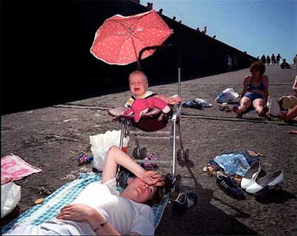
Although I am a graphics student, I have always been inspired by Martin Parr’s work because I love his innovative way of documenting the culture of the UK and abroad. My favourite works of his are his photographs of the British, particularly the seaside resorts of Brighton. He highlights our foibles and defaces us. His work could be seen as offensive, but I believe that is the beauty of his picture taking and there is truth in the images. He also takes on the stereotypes of the countries he visits. I found his blog to be very useful; http://www.martinparr.com/blog/. I find Martin Parr influential because of his satirical approach.


Bibliography

Wednesday, 8 December 2010

ITAP- Lesson 8

Peter Kennard
How Text Changes the Meaning of the Image
An image can alter a person’s feelings drastically whether it be for political reasons or emotional. For instance; taking a campaign like Domestic Abuse the poster or advert needs to gain an audiences’ disgust and be thought provoking to be effective. Adding text to the image can somewhat change a person’s reaction to the image in a different way. For example; political activists use humour to appeal to an audience. Photomontage artist Peter Kennard takes iconic images and merges them together to shock the audience even though they can be seen as humorous. However, to gain a better perception of an issue, text can change an image. Photographer Jim Goldberg took photographs of residents in a hotel and runaways on the street. He then got them to handwrite comments about themselves. The comments vary from fears and dreams to perceptions and illusions about themselves or their life. The one particular photograph that captured my attention was the image of the girl who looks skinny enough to be anorexic at a distance, but you look closely and see a scar, you then read the text and she describes her past and how her family hurt her “the fucked up ass hole shot me when I was 12 years old” (spelling mistake intended- her grammar). The message therefore deepens in what only can be described as disgust as you realise the girl is homeless not by her own doing and why she is indeed thin.
Jim Goldberg


John Heartfield
How Text Influences our Emotions
Text adds a story or feeling to an image. The text can alter a person’s prospective, particularly if the image is quite funny yet the text is a deep, political issue. For example; photomontage artist John Heartfield took on satirising Hitler. He made comic scenes that involved Hitler and added text to illustrate the scene in a political view. His most memorable work is "Hurrah, the Butter Is Finished!" here a typical German family are sitting at a table eating iron. Iron which ranges from weaponry to bicycle handles. The caption below the image states that “iron has always made a nation strong, butter and lard have only made the people fat”. Therefore, the image becomes disturbing and thought provoking. Changing our emotions can change our views on a subject. The images that use text aren’t always dark though, another artist that uses this concept is the brilliant Graham Rawle, he also is a photomontage artist that worked for the Weekend Guardian, he was the creator of the Lost Consonants series. The series was a text and image word play where he would take a sentence that has one crucial letter removed which alters the meaning. These were engaging as the reader would try and work out what letter was missing and are also humorous because the images were created from the sentences.
Graham Rawle

Bibliography